Modals are one of the most popular UI elements that enrich the user experience. Usually it informs about the errors, presents significant information, or provides a different way to show a form. In this tutorial, I will show how to create a simple reusable modal component using React. The repository with a code is available here.
Creating the modal component
First, we have to define the basic HTML for the modal.
index.js
import React from "react";
import PropTypes from "prop-types";
import "./index.css";

const ReactModal = ({ isOpen, closeHandler, config, modalContent }) => {
  if (!isOpen) return null;

  return (
      <div className="modal__container" onClick={() => modalConfig.onBgClose ? closeHandler() : null}>
        <div className="modal__box" onClick={(e) => e.stopPropagation()}>
          <div className="modal__header">
            <div className="modal__header-title">{modalConfig.title}</div>
            <div className="modal__header-close" onClick={closeHandler}>X</div>
          </div>
          <div className="modal__content">
            {modalContent}
          </div>
          <div className="modal__footer">
            <button className="modal__footer-button modal__footer-button--close" onClick={closeHandler}>Close</button>
            <button className="modal__footer-button modal__footer-button--accept"}>Accept</button>
          </div>
        </div>
      </div>
  )
}

export default ReactModal;
There are few props. Let’s describe what they’re for.
- isOpen - if the value is
true, modal is rendered in parent component, - closeHandler - that’s a function passed as props, which is triggered in a parent component,
- config - an object with options, here I added only 3 options,
- modalContent - this component is created dynamically which means that it can take any other component and render it inside the modal as a
children.
The modal I’m creating can be closed by background click. To make it working just trigger the closeHandler function on background click. Don’t forget to add a stopPropagation on the modal box, so it won’t close when the user clicks on the modal content. Here we can add optional handlers to close the modal. The popular one is to trigger this action by clicking the Escape key.
Styles of this component are straightforward. I skipped some properties from the repository in the snippet below.
.modal__container {
  display: flex;
  align-items: center;
  justify-content: center;
  position: fixed;
  background-color: rgba(146, 146, 146, 0.5);
  top: 0;
  bottom: 0;
  left: 0;
  right: 0;
}

.modal__box {
  display: grid;
  grid-template-columns: 1fr;
  grid-row-gap: 10px;
  margin: 0 25%;
  background: #f3f3f3;
  height: auto;
  border-radius: 5px;
}

.modal__header {
  display: grid;
  grid-template-columns: 4fr 1fr;
  color: #1f1f1f;
  padding: 15px;
}

.modal__header-close {
  cursor: pointer;
  color: #231f1f;
  font-weight: 700;
  text-align: right;
}

.modal__content {
  padding: 15px;
}

.modal__footer {
  display: flex;
  justify-content: flex-end;
  padding: 15px;
}
Adding PropTypes
To make this component more self-describing we can add some typings. In this example I’m using following PropTypes:
ReactModal.propTypes = {
  isOpen: PropTypes.bool.isRequired,
  closeHandler: PropTypes.func.isRequired,
  modalContent: PropTypes.node,
  config: PropTypes.shape({
    title: PropTypes.string,
    onBgClose: PropTypes.bool,
    footerDisabled: PropTypes.bool,
  })
};
We can add also default props, which means that if the particular props won’t be passed, the default value will be chosen. To do it we have to just specify defaultProps:
ReactModal.defaultProps = {
  config: {
    title: 'Default Title',
    onBgClose: true
  }
}
Unfortunately, it won’t work. Default props are merged only on a shallow level. If we want to define default props as object, we can use a trick here. Just define the default values as a regular object and then assign it as a new object:
const defaultProps = {
  config: {
    title: "Default title",
    onBgClose: true,
    footerDisabled: false,
  }
}

const ReactModal = ({ isOpen, closeHandler, config }) => {
  const modalConfig = Object.assign({}, defaultProps.config, config); // Overwrite passed props, leave the default props if not passed in props
  {...}
}
Re-using component
Now, let’s look how to implement ReactModal. Here is the code of the parent component:
index.js
import React, { useState } from "react";
import './App.css';
import ReactModal from "./components/ReactModal";

function App() {
  const [modalOpened, setModalOpened] = useState(false);

  return (
    <div className="App">
      <div className="main__container">
        <button className="main__container-button" onClick={() => setModalOpened(true)}>Open Modal</button>
        <ReactModal
          closeHandler={() => setModalOpened(false)}
          isOpen={modalOpened}
          config={{ title: "Test Header" }}
        />
      </div>
    </div>
  );
}

export default App;
Modal doesn’t have the state itself. Whether the modal is open or not is specified in the parent component, based on modalOpened state value. Here’s how it looks like:
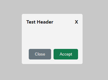
Creating a child component
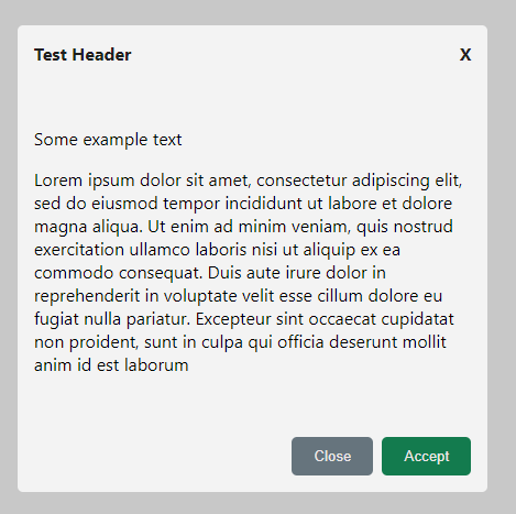
This scenario didn’t pass any content to the modal. Let’s create a child component that will be rendered inside the modal.
child.js
import React from "react";

const ChildComponent = () => {
  return (
      <div>
        <p>Some example text</p>
        <p>
          Lorem ipsum dolor sit amet, consectetur adipiscing elit, sed do eiusmod tempor incididunt ut labore et dolore magna aliqua.
          Ut enim ad minim veniam, quis nostrud exercitation ullamco laboris nisi ut aliquip ex ea commodo consequat.
          Duis aute irure dolor in reprehenderit in voluptate velit esse cillum dolore eu fugiat nulla pariatur.
          Excepteur sint occaecat cupidatat non proident, sunt in culpa qui officia deserunt mollit anim id est laborum
        </p>
      </div>
  )
}

export default ChildComponent;
And now we have to just pass the component to ReactModal as modalContent prop:
<ReactModal closeHandler={() => setModalOpened(false)}
            isOpen={modalOpened}
            config={{ title: "Test Header" }}
            modalContent={<ChildComponent />}
/>
And the result will be:
Conclusion
This is a very simple modal implementation using React. However, it can be easily enhanced by adding configuration options, handling asynchronous actions inside the modal (useful when creating a form inside the modal), or creating the animations to make it look more dynamic. That’s the big advantage of creating your own components or even libraries. You can adjust the code and features to your requirements.